
When I started my professional career, I had only the most vague sense of how visual aesthetics related to business.
I knew there were brands that I was inherently attracted to, such as Apple. And I had a fairly good sense for what was beautiful, from a childhood spent in museums and art galleries with my artist father. But no one would have accused me of having good taste.
I had the good fortune of landing at a small, boutique consulting firm in San Francisco, which employed a couple skilled designers. I watched from the sidelines as they redesigned our company branding from scratch. The firm also operated a coworking and event space downtown, and I would often stay late at the office to help manage the events we hosted.
The meetups and workshops related to design always caught my attention. I was introduced to a fantastical world of deep patterns and subtle touches and visual “systems” designed to evoke very specific kinds of experiences in the minds of customers.
I began to see that design was a kind of subterranean layer of reality, communicating in pre-verbal ways to subconscious parts of our brains that are not completely logical. I saw that great design differentiated the best ideas, products, and companies. And that you could intentionally pursue and invest in good design as a strategic asset that was difficult for others to copy.
My father, who once attended fashion school before switching to painting, always told us that “Fashion is what you say about yourself before you open your mouth.” I can’t say I took that advice when it came to my own wardrobe choices. But when applied to companies, I realized that a brand is what a company says about itself before it’s said anything. In a world where we are skeptical of everything, design is an expensive signal that’s hard to completely fake.
When I started Building a Second Brain, I knew I wanted it to be visually distinctive from the very beginning. I wanted to distance myself as much as possible from the scammy world of online marketing from which most courses come, which is fixated on “conversions” at the expense of anything beautiful, elegant, or timeless.
From my experience working alongside professional designers, I also knew that design is incredibly expensive. Not just in terms of money, but also time, attention, caring, and feedback. I couldn’t afford to make that investment in the beginning, so I turned to pre-made templates for slides and logos found on websites like Creative Market.
And I bided my time until I could afford to create a brand that I was proud to stake my reputation on.
In January, it will be 5 years since the first cohort of the Building a Second Brain course. Somehow, we’ve delivered 13 cohorts to more than 5,000 graduates from more than 100 countries. It has all gone so much further than anything I ever expected.
And yet I have this feeling once again of standing on a precipice of something much bigger. In August 2022, the Building a Second Brain book comes out, to be published in multiple countries by the world’s most respected publishing houses. The number of people who have easy access to these ideas will increase by an order of magnitude or more, and we will see if creating a Second Brain is something that appeals beyond our tiny niche.
Early this year as I made progress on the manuscript, I decided it was finally time for us to create a brand that would resonate beyond our existing community. I knew that our roots in the software and technology industry that had carried us so far would soon become a hindrance, limiting the reach of our message. I felt it was time to zoom out from the implementation details and craft a visual message that could transcend any particular software, industry, or time period.
I hired a world-class designer named Maya P. Lim, and we got to work. We closely examined the current branding to pick out what worked, and what didn’t. We studied existing brands in traditional education, self-help, and online learning to identify what set BASB apart. We pored through the feedback surveys from the last few cohorts of the course, looking for common patterns.
Our goal became to double down on the most unique and powerful elements of our existing culture, discard or deemphasize the parts that no longer worked, and paint a visual picture of a future where everyone has the opportunity to acquire the skills that we teach.
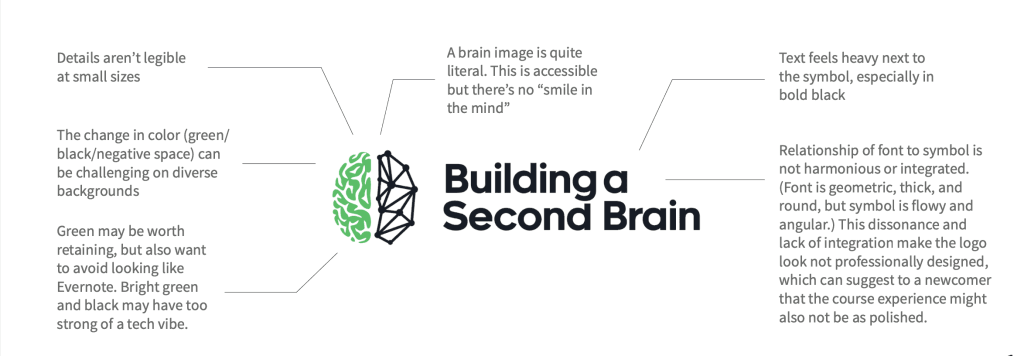
Looking at the current logo, which I had designed for about $150 on 99Designs, there were a number of significant issues that we wanted to address:
- The software look and feel appealed strongly to techies and infovores who eagerly try out new products, but we wanted to broaden its appeal in preparation for the book release.
- The current logo felt friendly and approachable, but didn’t convey the premium experience we deliver or a sense of authority in the emerging PKM space.
- It was filtering out people who rely on a strong sense of credibility before trying new things, who don’t have the time or inclination to consume a lot of content before making a commitment.

More technically, there were aspects of the logo that would break down as we began to extend the branding to different use cases and mediums:
Over a period of about 4 months, Maya incorporated all of these observations and decisions into our new visual identity, which I know will serve as a vehicle for spreading our message to millions of people in the years to come.
We’ve created a dedicated Brand Guide for Building a Second Brain, so anyone who wants to write about, talk about, or create content about our work can access everything they need in one convenient place. It includes a fair use guide, complete brand guidelines, high-quality logos and other visual assets, and a media kit with my headshots, bio, and important links.
Over time we’ll continue to update and add to this guide as new assets become available:
The New Building a Second Brain
Let me share our new brand with you!
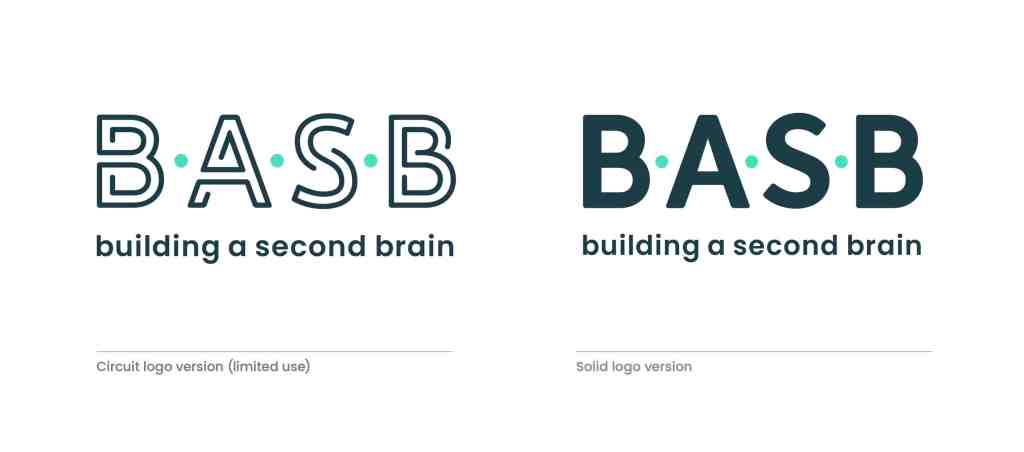
We decided to create two versions of the logo. The solid logo version (on the right) is the everyday, more versatile version because it is very accessible at small sizes. The circuit logo (on the left) is reserved for high-drama, hero moments, where the logo is presented in large sizes and the circuit lines help tell our story on their own.
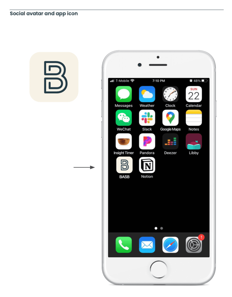
For situations requiring a symbol or icon we also created a stand-alone B logo. The B stands for “Building” and “Brain” and uses shapes reminiscent of the two hemispheres of the brain, while also suggesting movement and change.
Design rationale
Circuit language
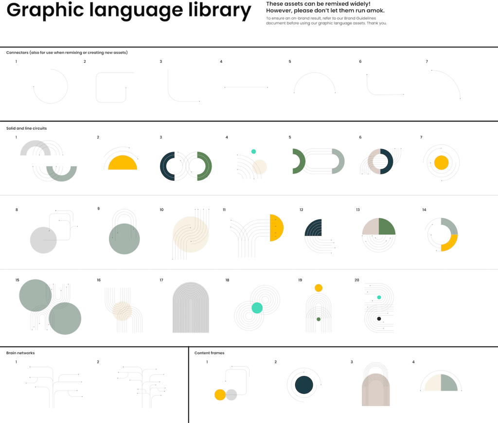
Maya created a new visual language dubbed “Circuit,” which starts with the logo and extends across all our touchpoints. We wanted to abstract away the details of specific software programs, and focus on the bigger picture ideas that apply universally to many different kinds of people.
Circuit-like shapes are a clear reference to technology, but also incorporate movement, fluidity, connectivity, systems, structures, and networks. They are strong links, but also flexible in routing information to wherever it needs to go. They exist at many scales, from chemical bonds to neural circuits to urban transportation networks to the fractal complexity of galaxies.
We’ve created a library of basic shapes using the Circuit language to be able to mix and match to produce any visual asset we need in the future:
Acronym
Building a Second Brain is a relatively long name, so we decided to double down on the “BASB” acronym that many people already use, both internally and externally, as a shorthand. Like GTD before us, our goal is to create a compact idea that can find its way efficiently through networks, both technological and social.
The dot separators reinforce the circuit language system and show that “BASB” shouldn’t be pronounced as a word. We have a version of the logo with the full name below for audiences that aren’t familiar with the acronym. Over time, we hope to build enough brand equity that the four letters can stand on their own.
Approachability
The practice of knowledge management can sometimes be intimidating, so we wanted the logo to signal that we present it in a humane, approachable way. Soft curves in the letters and a lowercase title are meant to convey a soft touch. Parallel lines are strong but also suggest guidance and intentionality.
Accessibility
My biggest goal for the book is that it reach every person on the planet who wants to create a system of knowledge management. Every decision related to the book has been made to maximize reach and accessibility, and the logo is no different.
Maya conducted accessibility testing with our color palette to provide suggested combinations that achieve high accessibility ratings when set in text (according to the Web Content Accessibility Guides at w3.org).

Our key attributes
To guide the overall branding effort, we chose three words to represent the “soul” or essence of the brand we wanted to create:
Structured
Structures provide a strong, stable foundation for building anything. We believe that a structured system enables creativity, rather than restricting it. When needed, structures can (and should) be broken—but never in a way that is thoughtlessly random. We appreciate logic behind everything that we build.
Accessible
Information touches all of our lives. We believe that anyone can manage and harness information in ways that empower them. Our content is easy to understand and visually welcoming. Although our roots are in technology, we also have a warm, human side. Our approachability signals that our products and services are relevant to audiences much broader than infovores and techies.
Quiet determination (my favorite)
Noise is distracting. We believe that the energy of quiet determination helps when creating a system to achieve focus and clarity. Although we are confident and authoritative, we are always humble. We never shout, but we aren’t afraid to be bold.
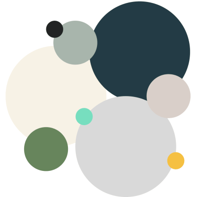
Colors
We chose to stick with green as a general palette, both to honor our origins in the Evernote ecosystem, and to signal wisdom and growth. But we also wanted to differentiate ourselves from Evernote’s branding and to create more subtlety and options for the many ways we’ll be using the logo.
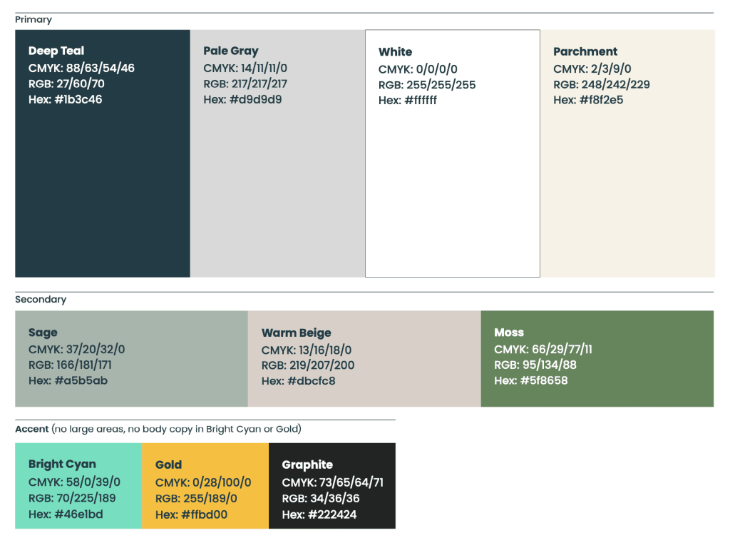
We ultimately decided on primary colors of Deep Teal (representing calm and concentration), Pale Gray (authority and sophistication), White (clarity and optimism), and Parchment (harkening back to the wide open possibilities of the paper notetaking from which our work descends).
The secondary colors are Bright Cyan (energy and excitement), Moss (timelessness and growth), Gold (inspiration and sparks of creativity), and Graphite (engineering and functionality)
Here are the colors in general proportion to how they’ll be used:
Typeface
Our culture is highly textual, a legacy of the reading, writing, and notetaking that is such a core part of everything we do. To that end, we chose a simple, practical, direct typeface called Poppins.
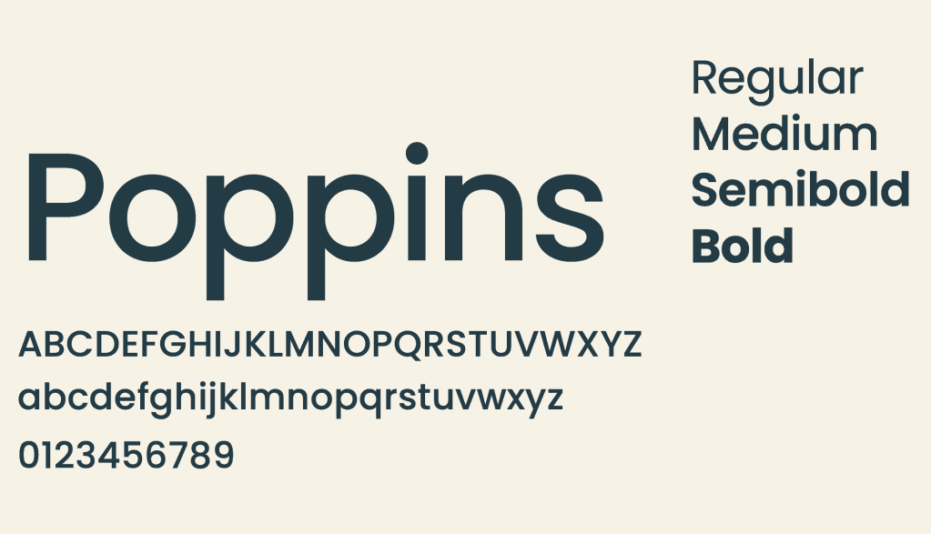
Poppins is freely available as a Google Web Font, which means anyone can download and use it online or offline, free of any licenses or restrictions. It conveys warmth, friendliness, and practicality, but also modernness through its geometric lines. With its tall x-height and large counter spaces, it is also highly legible at small sizes and in both digital and print contexts.
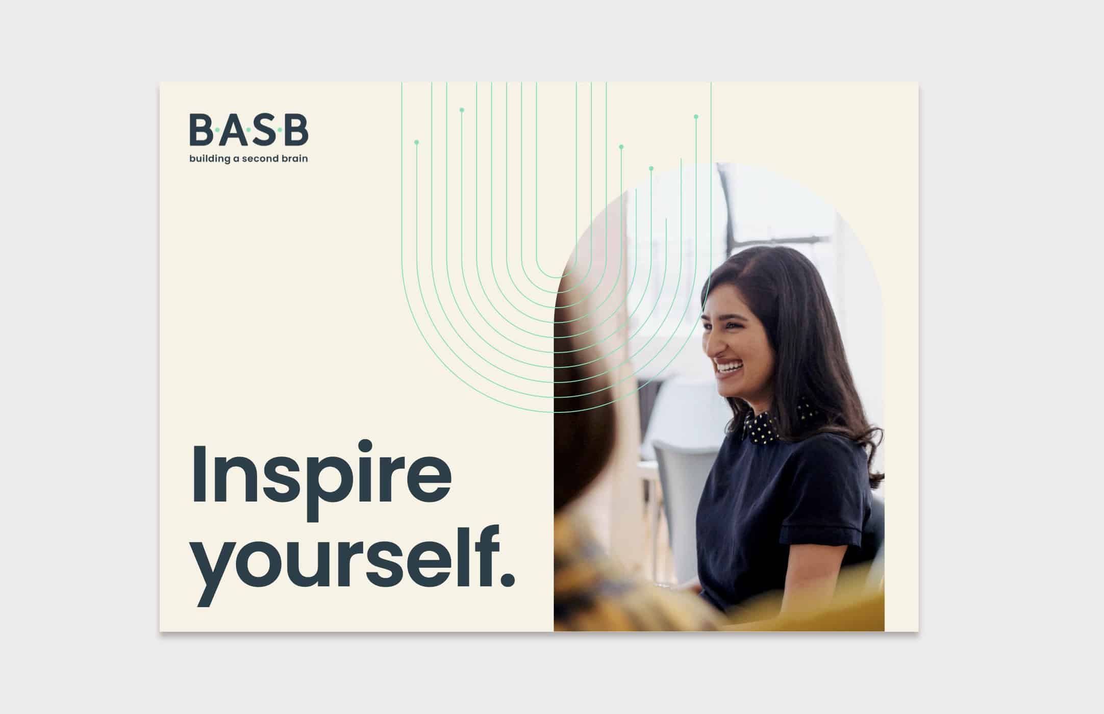
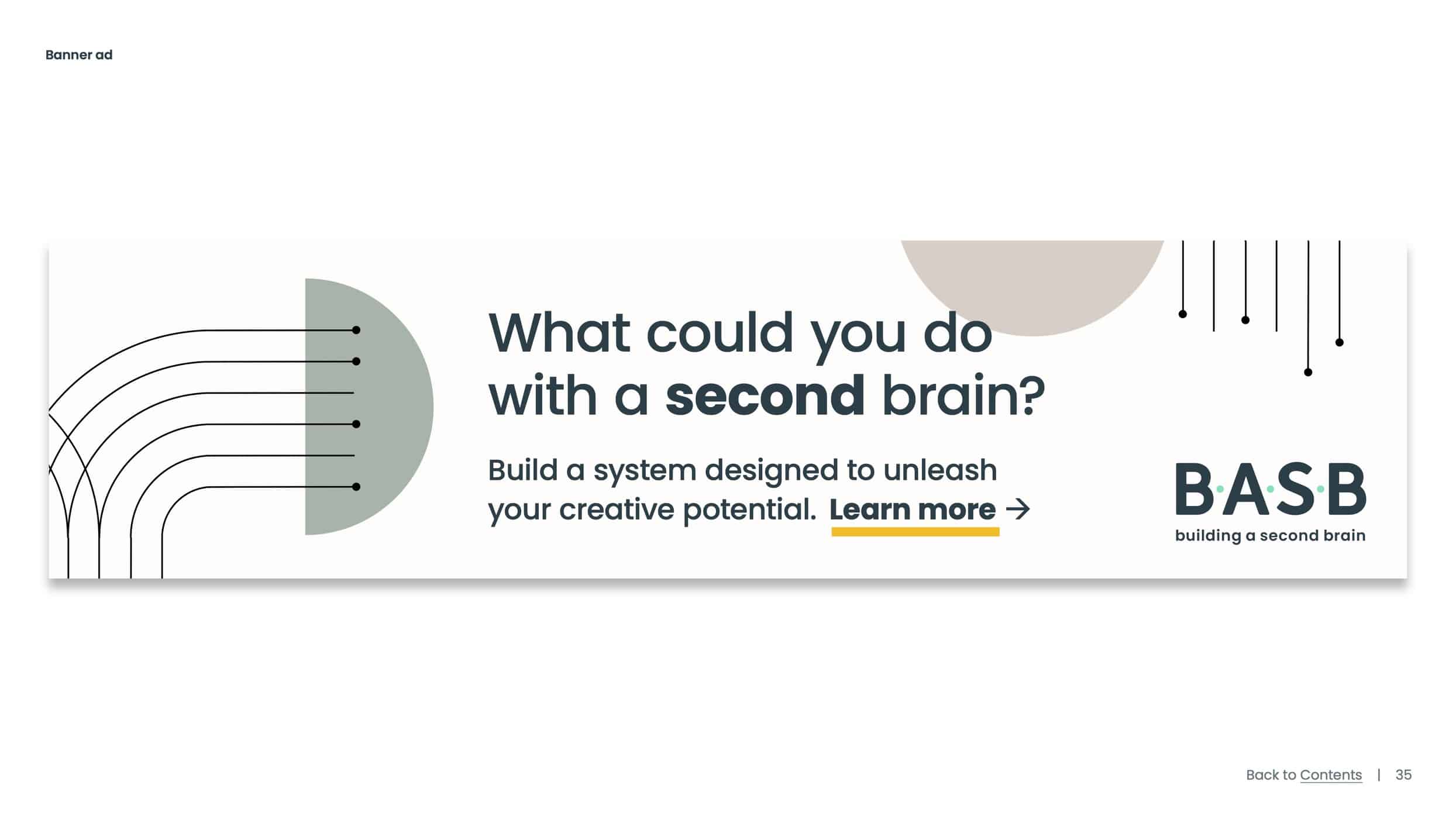
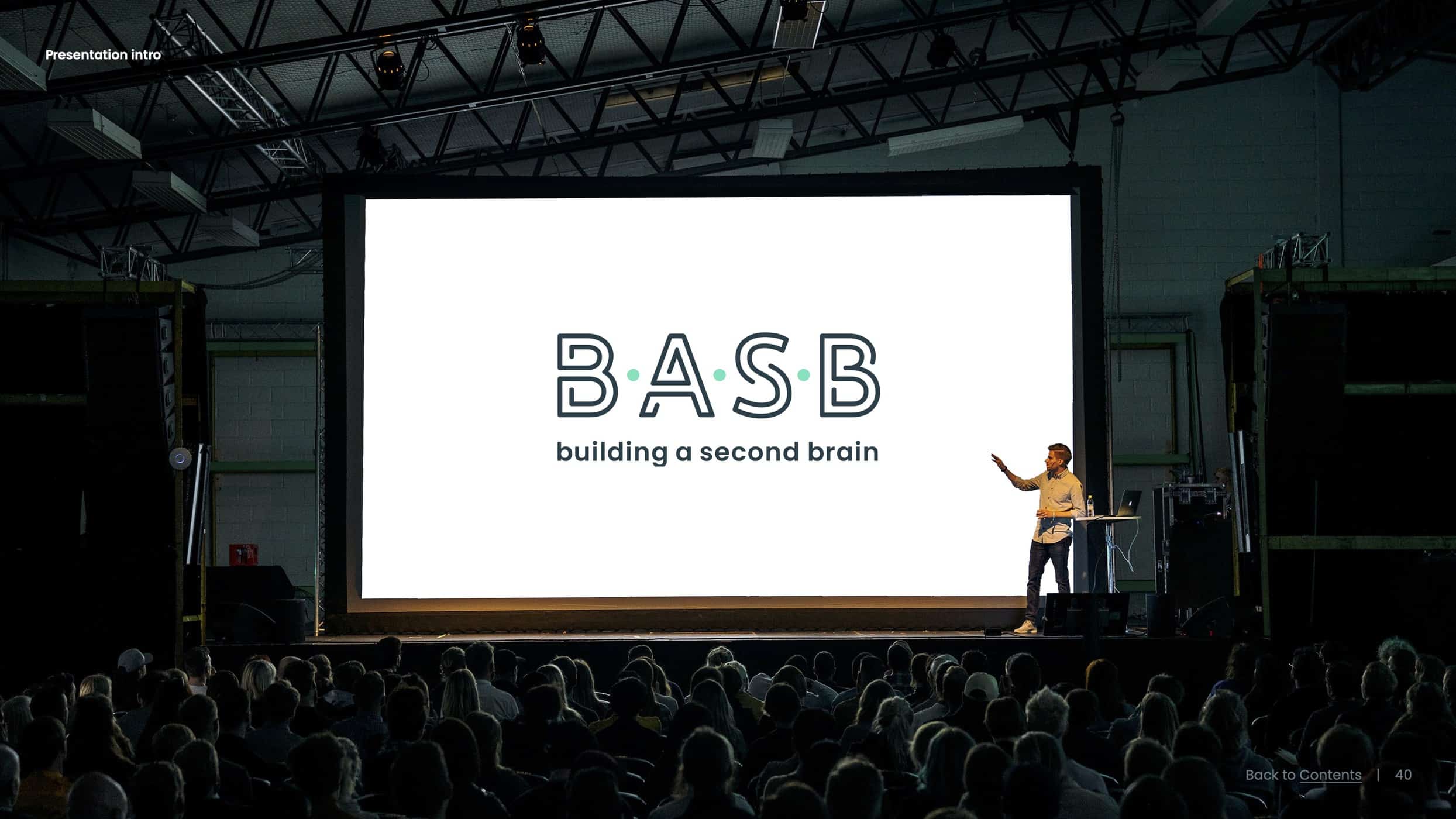
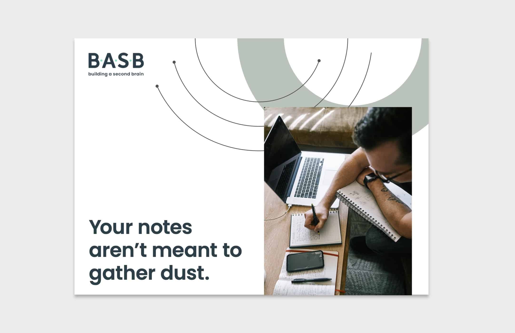
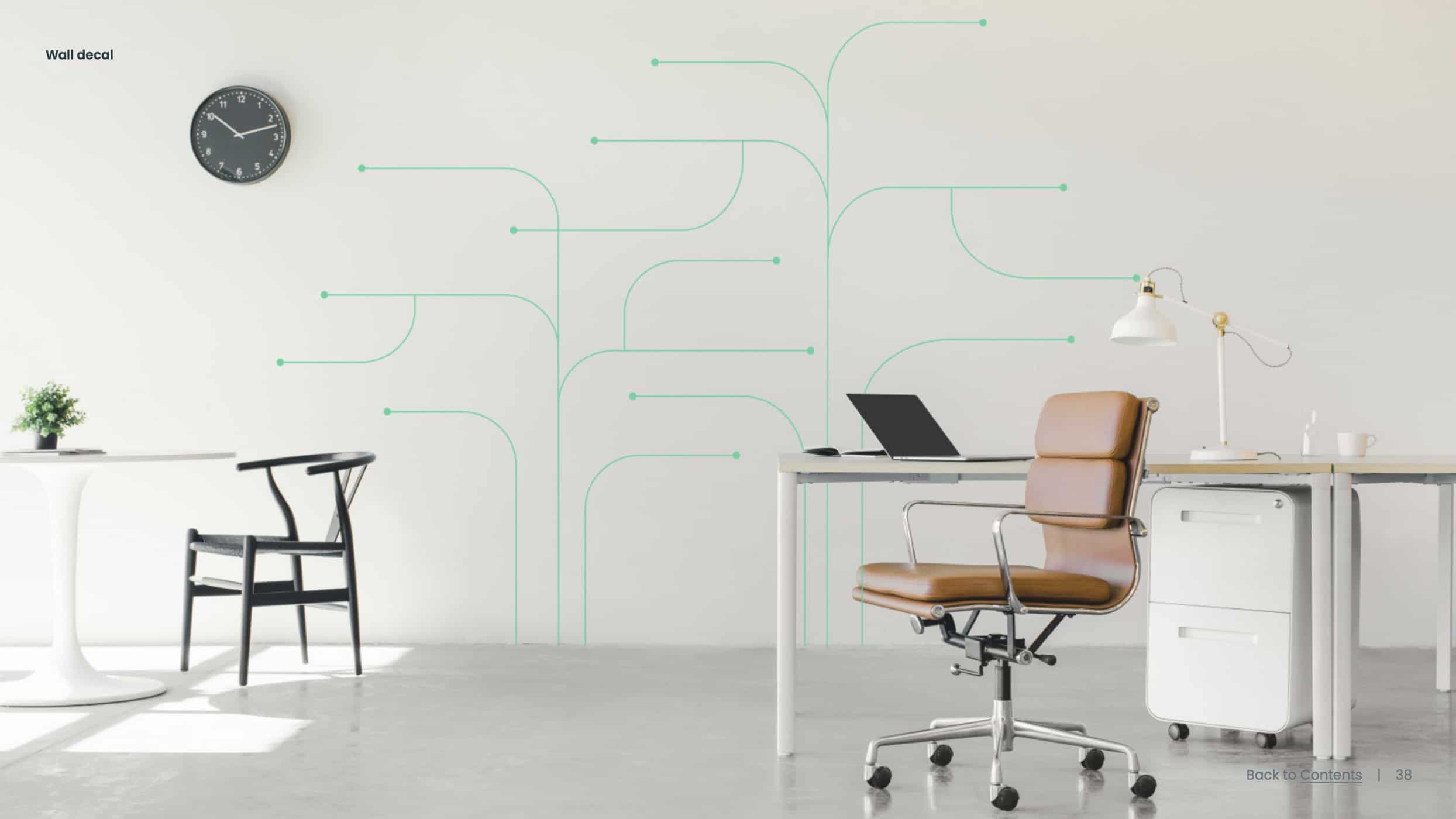
Creative gallery
The elements above form not only a new brand, but a visual language that we will use in the coming years to create a universe of BASB products, experiences, services, and content.
The gallery below serves as a sneak peek into the possibilities that future may hold.
Follow us for the latest updates and insights around productivity and Building a Second Brain on X, Facebook, Instagram, LinkedIn, and YouTube. And if you’re ready to start building your Second Brain, get the book and learn the proven method to organize your digital life and unlock your creative potential.
- Posted in Building a Second Brain, Design, Entrepreneurship, Marketing
- On
- BY Tiago Forte